Matt Parker recently showed us how to create multi-tab reports with R and jQuery UI. His example was absurdly easy to reproduce; it was a great blog post.
I have been teaching myself Shiny in fits and starts, and I decided to attempt to reproduce Matt’s jQuery UI example in Shiny. You can play with the app on shinyapps.io, and the complete project is up on Github. The rest of this post walks through how I built the Shiny app.
It’s a demo
The result demonstrates a few Shiny and ggplot2 techniques that will be useful in other projects, including:
- Creating tabbed reports in Shiny, with different interactive controls or widgets associated with each tab;
- Combining different ggplot2 scale changes in a single legend;
- Sorting a data frame so that categorical labels in a legend are ordered to match the position of numerical data on a plot;
- Borrowing from Matt’s work,
- Summarizing and plotting data using dplyr and ggplot2;
- Limiting display of categories in a graph legend to the top n (selectable by the user), with remaining values listed as “other;”
- Coloring only the top n categories on a graph, and making all other categories gray;
- Changing line weight for the top n categories on a graph, and making;
Obtaining the data
As with Matt’s original report, the data can be downloaded from the CDC WONDER database by selecting “Data Request” under “current cases.”
To get the same data that I’ve used, group results by “state” and by “year,” check “incidence rate per 100,000” and, near the bottom, “export results.” Uncheck “show totals,” then submit the request. This will download a .txt tab-delimited data file, which in this app I read in using read_tsv() from the readr package.
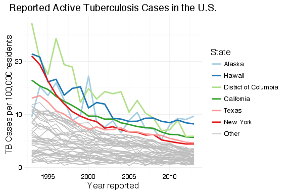
Looking at Matt’s example, his “top 5” states look suspiciously like the most populous states. He’s used total count of cases, which will be biased toward more populous states and doesn’t tell us anything interesting. When examining occurrences—whether disease, crime or defects—we have to look at the rates rather than total counts; we can only make meaningful comparisons and make useful decisions from an examination of the rates.
Setup
As always, we need to load our libraries into R. For this example, I use readr, dplyr, ggplot2 and RColorBrewer.
The UI
The app generates three graphs: a national total, that calculates national rates from the state values; a combined state graph that highlights the top  states, where the user chooses ; and a graph that displays individual state data, where the user can select the state to view. Each goes on its own tab.
ui.R contains the code to create a tabset panel with three tab panels.
tabsetPanel(
  tabPanel("National", fluidRow(plotOutput("nationPlot"))),
  tabPanel("By State",
           fluidRow(plotOutput("statePlot"),
                    wellPanel(
                      sliderInput(inputId = "nlabels",
                                  label = "Top n States:",
                                  min = 1,
                                  max = 10,
                                  value = 6,
                                  step = 1)
                    )
           )
  ),
  tabPanel("State Lookup",
           fluidRow(plotOutput("iStatePlot"),
                    wellPanel(
                      htmlOutput("selectState"))
           )
  )
)
Each panel contains a fluidRow element to ensure consistent alignment of graphs across tabs, and on tabs where I want both a graph and controls, fluidRow() is used to add the controls below the graph. The controls are placed inside a wellPanel() so that they are visually distinct from the graph.
Because I wanted to populate a selection menu (selectInput()) from the data frame, I created the selection menu in server.R and then displayed it in the third tab panel set using the htmlOutput() function.
The graphs
The first two graphs are very similar to Matt’s example. For the national rates, the only change is the use of rates rather than counts.
df_tb <- read_tsv("../data/OTIS 2013 TB Data.txt", n_max = 1069, col_types = "-ciiii?di")

df_tb %>%
  group_by(Year) %>%
  summarise(n_cases = sum(Count), pop = sum(Population), us_rate = (n_cases / pop * 100000)) %>%
  ggplot(aes(x = Year, y = us_rate)) +
  geom_line() +
  labs(x = "Year Reported",
       y = "TB Cases per 100,000 residents",
       title = "Reported Active Tuberculosis Cases in the U.S.") +
  theme_minimal()
The main trick, here, is the use of dplyr to summarize the data across states. Since we can’t just sum or average rates to get the combined rate, we have to sum all of the state counts and populations for each year, and add another column for the calculated national rate.
To create a graph that highlights the top states, we generate a data frame with one variable, State, that contains the top states. This is, again, almost a direct copy of Matt’s code with changes to make the graph interactive within Shiny. This code goes inside of the shinyServer() block so that it will update when the user selects a different value for . Instead of hard-coding , there’s a Shiny input slider named nlabels. With a list of the top states ordered by rate of TB cases, df_tb is updated with a new field containing the top state names and “Other” for all other states.
top_states <- df_tb %>%
      filter(Year == 2013) %>%
      arrange(desc(Rate)) %>%
      slice(1:input$nlabels) %>%
      select(State)

df_tb$top_state <- factor(df_tb$State, levels = c(top_states$State, "Other"))
df_tb$top_state[is.na(df_tb$top_state)] <- "Other"
The plot is generated from the newly-organized data frame. Where Matt’s example has separate legends for line weight (size) and color, I’ve had ggplot2 combine these into a single legend by passing the same value to the “guide =” argument in the scale_XXX_manual() calls. The colors and line sizes also have to be updated dynamically for the selected .
    df_tb %>%
      ggplot() +
      labs(x = "Year reported",
           y = "TB Cases per 100,000 residents",
           title = "Reported Active Tuberculosis Cases in the U.S.") +
      theme_minimal() +
      geom_line(aes(x = Year, y = Rate, group = State, colour = top_state, size = top_state)) +
      scale_colour_manual(values = c(brewer.pal(n = input$nlabels, "Paired"), "grey"), guide = guide_legend(title = "State")) +
      scale_size_manual(values = c(rep(1,input$nlabels), 0.5), guide = guide_legend(title = "State"))
  })

})
The last graph is nearly a copy of the national totals graph, except that it is filtered for the state selected in the drop-down menu control. The menu is as selectInput() control.
renderUI({
    selectInput(inputId = "state", label = "Which state?", choices = unique(df_tb$State), selected = "Alabama", multiple = FALSE)
  })
With a state selected, the data is filtered by the selected state and TB rates are plotted.
df_tb %>%
  filter(State == input$state) %>%
  ggplot() +
  labs(x = "Year reported",
       y = "TB Cases per 100,000 residents",
       title = "Reported Active Tuberculosis Cases in the U.S.") +
  theme_minimal() +
  geom_line(aes(x = Year, y = Rate))
Wrap up
I want to thank Matt Parker for his original example. It was well-written, clear and easy to reproduce.
 may not be meaningful. This typology is a useful thinking tool, but it is essential to understand the statistical methods being applied and their sensitivity to departures from underlying assumptions.
 list where all columns must be vectors of the same number of rows (determined with NROW()). However, unlike matrices, different columns can contain different types of data and each row and column must have a name. If not named explicitly, R names rows by their row number and columns according to the data assigned assigned to the column. Data frames are typically used to store the sort of data that industrial engineers and scientists most often work with, and is the closest analog in R to an Excel spreadsheet. Usually data frames are made up of one or more columns of factors and one or more columns of numeric data.

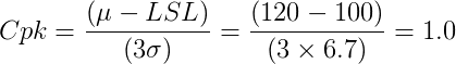
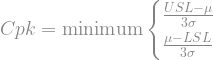
 kg, reducing mean weight from 120 kg to 108 kg.
 and our 95% confidence of the standard deviation,
  .
.
 and
and  from such trials, we cannot simply calculate
  and
and  and then calculate the estimated Cpk based on the sample, since there is a 50% chance that our products will be worse than we measure from our study. We have to be more careful with our customer base than that.
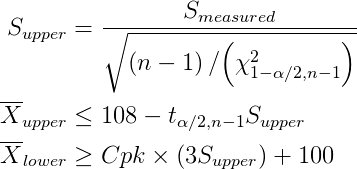

 the smaller the difference,
  that we can detect. The error,
  , in our estimate of the differences gets smaller as sample size increases:
 and ensure that it is different than 0 (or some other pre-determined value). The minimum difference that we can reliable detect is plotted below for different sample sizes.
 , where
  is the larger of the two variances. The dependence on sample size is illustrated below.
 .
.
 , is proportional to the standard deviation of the sample,

 standard deviation.
 , is within the shaded band based on the measured sample proportion
  . Since this confidence interval depends on


 kg.
kg.
 , statistically we have
 ; in more colloquial terms, we conclude that the apparent difference between 8/36 and 1/9 is only due to random errors in sampling. (For larger counts of successes and failures,

You must be logged in to post a comment.